Citrix GoToAssist Onboarding
Late 2014
GoToAssist Service Desk is a complex product – one that is too far down the rabbit hole to simplify. It’s rarely a product someone would sign up for and be familiar with immediately. It’s rooted in ITIL methodologies, which are guidelines on how to structure business processes. In our case, they’re applied to Service Management + mostly tech support.
Brief
Take the existing user onboarding process and refresh it to be more educational, and ultimately drive more conversions to paying customers.
I worked with a copywriter to put together clear steps for users to follow to complete certain tasks, PM's to define metrics to measure success, and learned some tricks about remote testing from the broader design team.
Process
My first step was to establish what was/wasn’t working. I used it myself, documented the process, and tore it apart with my colleagues in a sketching session with printed screenshots. Long story short – our onboarding was too simplistic. It pointed out obvious things (“this is a customer card”) but did a poor job of explaining the relationship between record types, a key thing you need to understand to get value out of the system. That said, it did get users to open records and interact with the system.
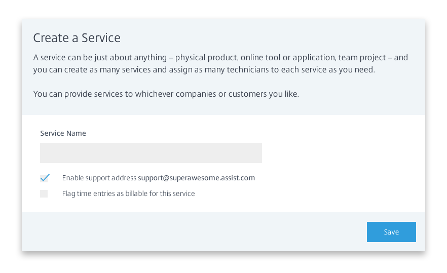
We were also using the main app interface to get users to do things like Create a Service – something you don’t need to do often, and isn’t that important you learn how to do within the app. I knew that breaking this out into a simplified, dedicated step in the onboarding process would speed up the time it took for the user to get to some of our more important & relevant steps.
Next, I worked with product management to identify key actions that lead to understanding the system & conversion.
What do people do that makes them stay? Why do these things help?
- Create a service
- Setting up something outside the Demo Service helps better fit the product into their business processes and mindset. It's important they put their own fingerprints into the system as soon as possible.
- Link records together
- Incidents, Problems, Changes and Releases are each record types that represent steps in the process. Understanding that; why & how they’re different is important to understanding the system as a whole
- Invite another expert
- Service Desk isn’t very useful as an individual. People handling Incidents are rarely the people implementing Changes & Releases. By inviting new experts, the user exposes the value of the system.
- Add a customer
- If a user adds a customer, they’re using it within their business processes or seriously evaluating that possibility. Most often the first “customer” is the user themselves, so they can see what kind of communications we’re sending out from the system & try out the customer portal.
- Configure email ticket receipt
- The most common way of handling support requests. Setting this up allows them to immediately start using the system to handle incoming incidents.
I’m always trying to read between the lines, seeing how we can do something now that makes us more efficient in future. We wanted to implement better feedback tools, better communication with our user base of new features, etc.
I proposed we alter the scope of the project: onboarding would be a feature we build upon a framework for communication. I ultimately designed standard sidebars, checklists, callouts, toasters and modals that were generic and could be reused and recombined for all our communication.
Design & Test
Since completing these tasks is so important, I decided a checklist of sorts would be the best way forward. I’d researched other onboarding types and this was relatively common.
- Easy to modify & iterate upon
- We would be adding features often.
- We considered having different onboarding processes for our different personas – technical setup, 3rd party purchaser, etc. and wanted to keep this option open
- Occupies a static point on the screen
- Customer Care/Sales can walk users through the process if doing a guided onboarding.
- Technically, since Service Desk is not responsive, it makes life easier for us to ensure the user is seeing the correct layout.
- Easy to apply analytical tracking
- We can see what users attempt & complete.
- Tracking drop-off is important so we can potentially re-arrange the list to optimize it.
- People see the end goal - it's important we try and get users to complete as many as possible
Sidebar
An assumption I made during the initial designs was that the sidebar should really stand out. The UI is light, so I made the sidebar dark with a new (somewhat randomly chosen) colour. I knew I wanted to test this assumption – lucky I did. Sitting with a user, he completely missed it. Many usertesting.com participants in my InVision prototype were confused initially, also. Ultimately, user testing revealed that users thought it was a part of their browser/another page rather than something they needed to pay attention to.
I modified the design to more closely match the interface (we were planning branding refreshes of the product, so I designed in line with them) and got much better results.

Callouts
Since the interface is quite intimidating, I also designed some callouts we could attach to elements on the page and guide users through creating their first Incident and linking it to another Record. We could also re-use these elements when introducing new features to existing customers.
I intended for users to progress through the callouts by actually performing an action the callout was attached to. This proved to be a difficult thing for people to grasp, so a few evolutions of the callout were tested & ultimately we went with a button within the callout which allowed you to step forward in the process. The button worked because users were afraid to break the product. Having a call-to-action within the educational material makes them a bit more comfortable, especially considering these steps are some of the first interactions the users are having with the product at all.

Triggers
There’s lots to configure in Service Desk, and it doesn’t make sense to do it all at once. It especially doesn’t make sense to do it all in the beginning!
I conceived of Triggers to progressively disclose information and tips to users as they did certain things/explored certain places in the system.
- When you’ve created 5 Incidents, prompt to create a Problem and link them – and explain why that’s a good practice.
- When you link multiple Incidents to the same Problem, propose creating a Change – and explain a little more.
- Propose modifying Custom Fields, Triggers, etc. when exploring more advanced settings.
- After 5 days, prompt request for callback.

Emails
Further thought was put into how we could sync email and in-app messaging to progressively disclose information to users. We could also tailor this messaging depending on usage statistics – Case Studies & white-glove-onboarding emails to low activity users, pro-tips and tricks to people really getting into the system.
Ultimately modifying emails fell through as it required the buy-in of our Marketing department, who weren’t onboard. Nonetheless, we planned it. We decided to build out our in-app Triggers to do similar things, though we could only reach users that came to the site.